

conscious-quantum-realm
What if karma meets the dharma ....? let's explore the conscious life on earth and beyond
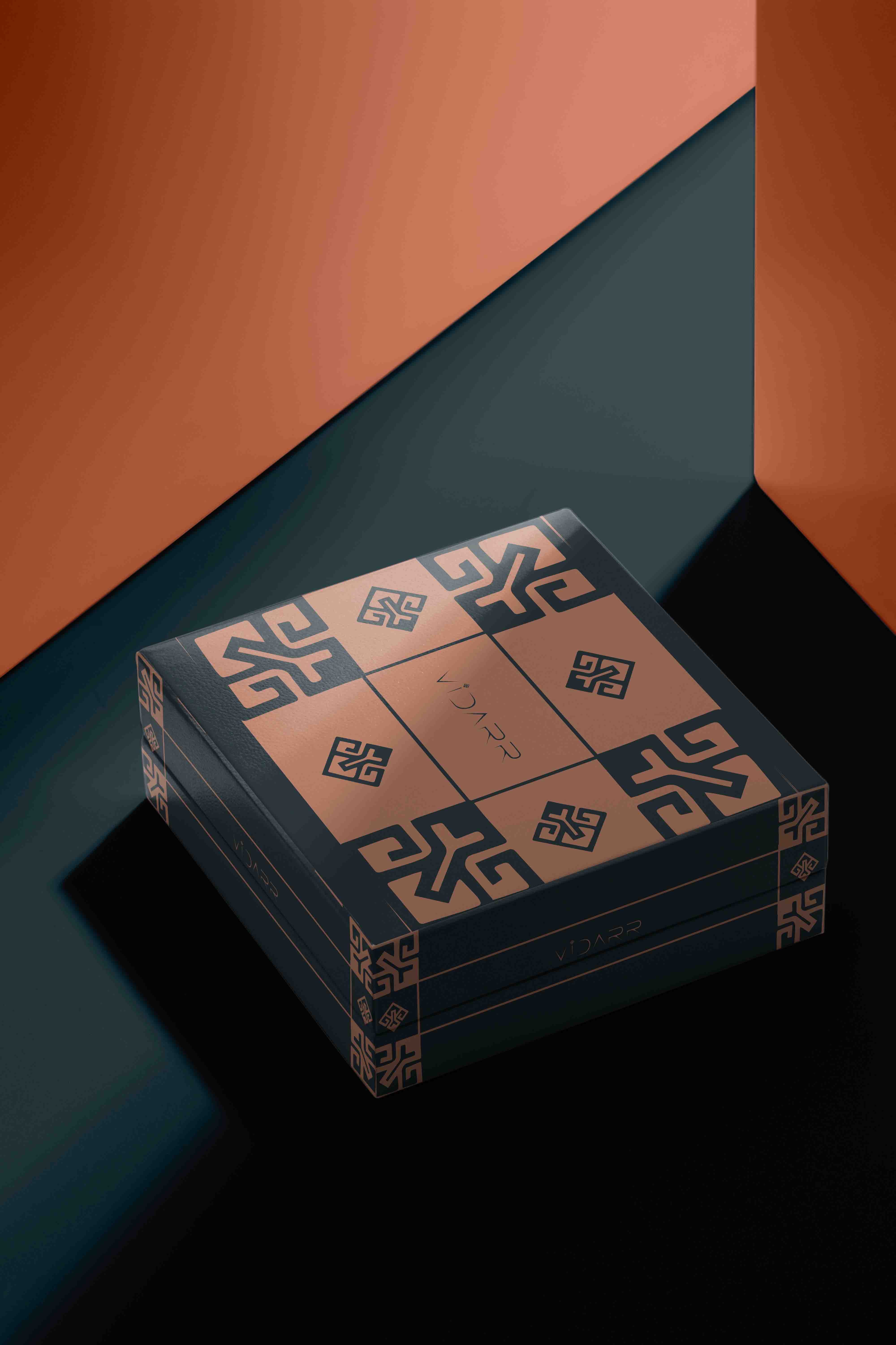
CELESTIAL CLOTHING BRAND
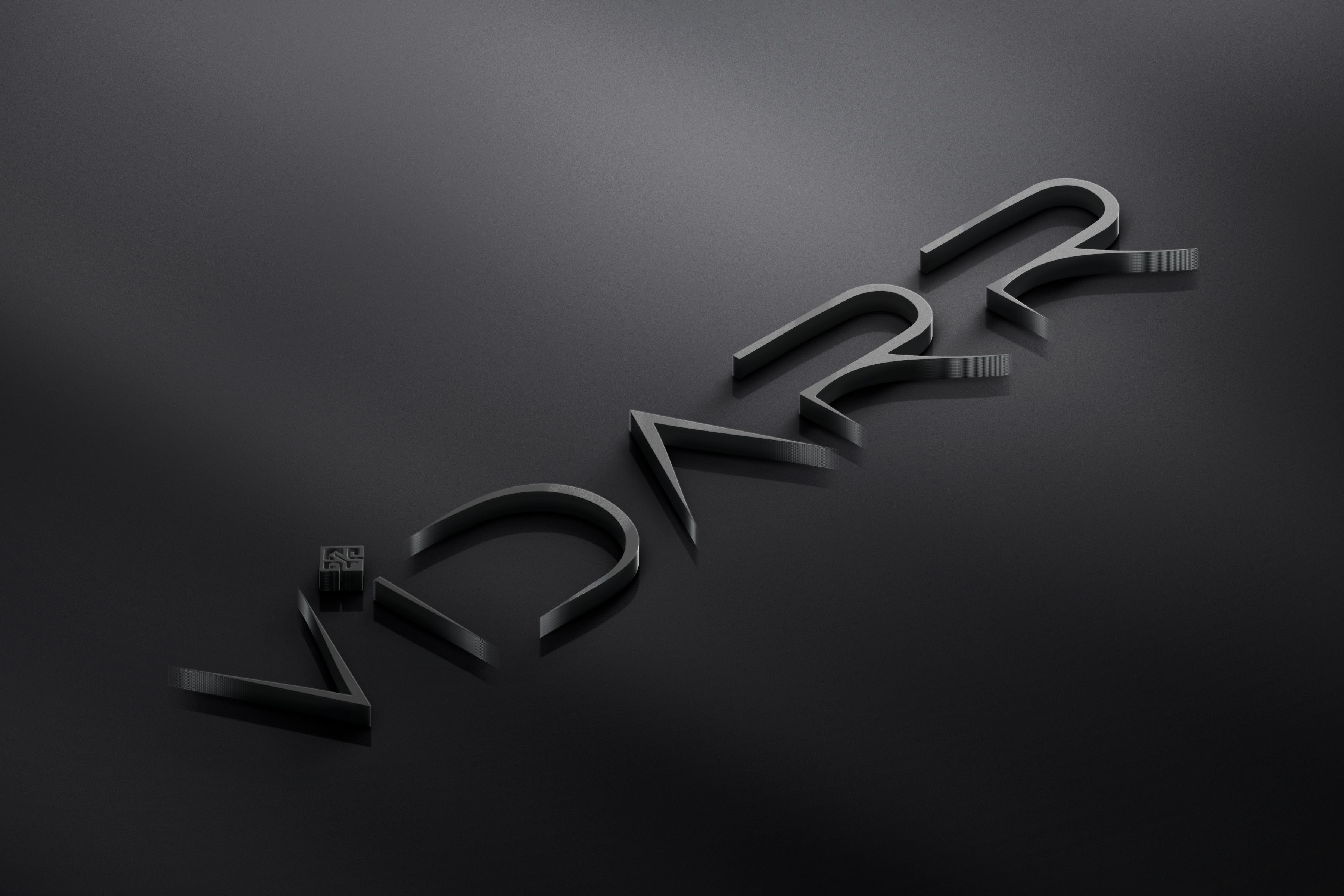
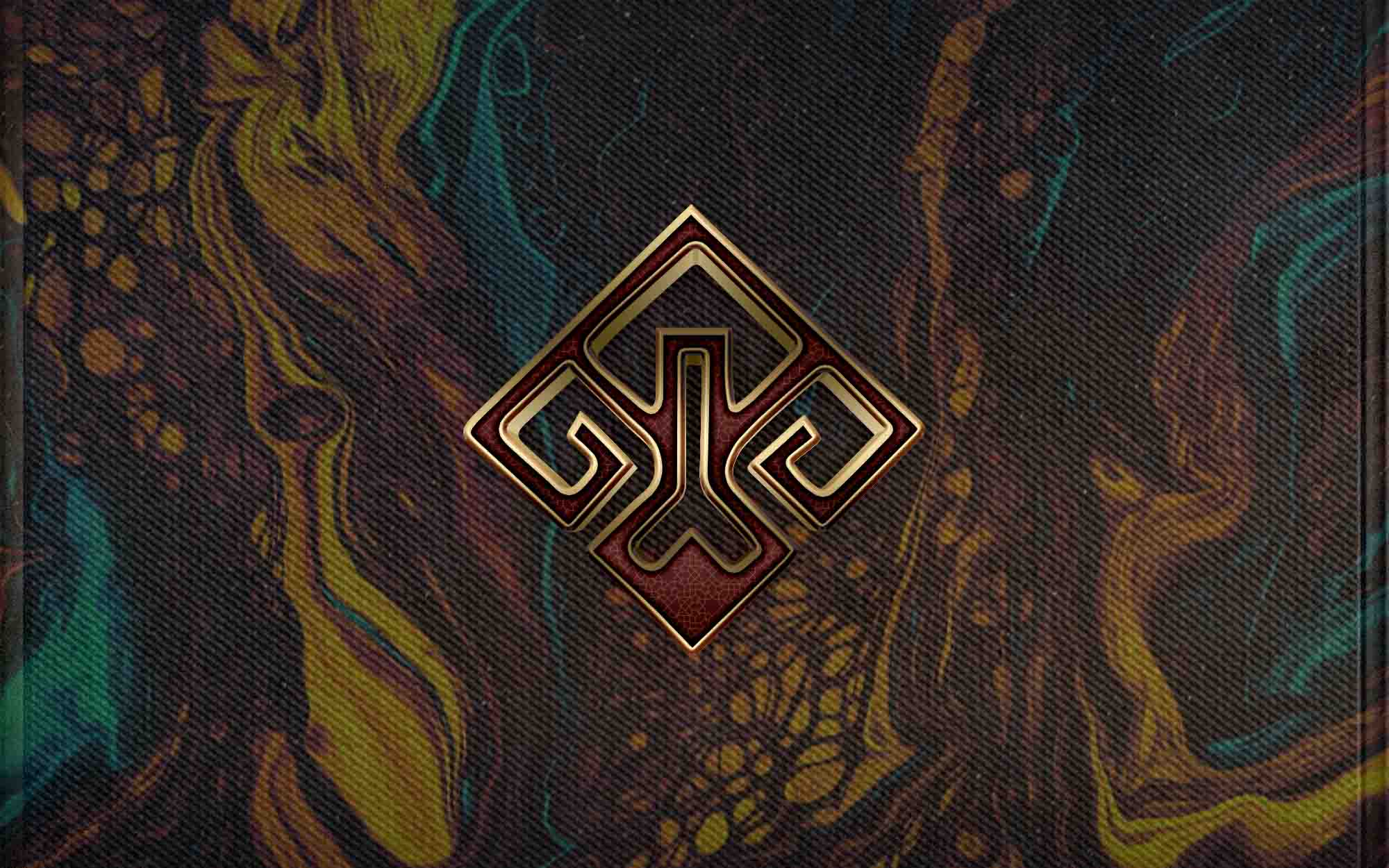
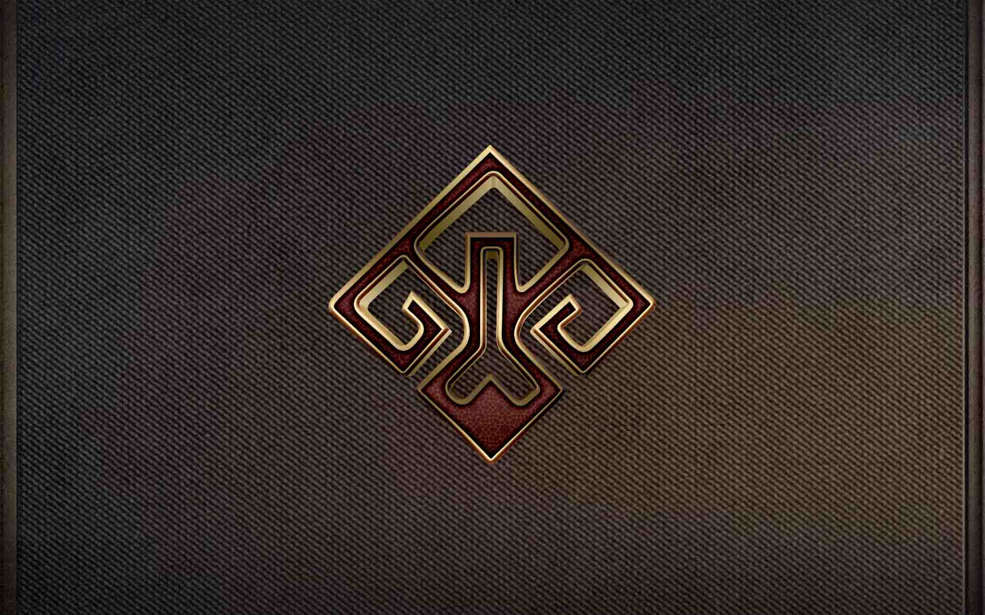
A ferocious crown was a passive tree, reaching for the sky now, deep roots digging down into the earth, a powerful proclamaiton of strength and resilience. And what began with this inversion became the bedrock of the Vidar brand. Rebellion was what it wasn’t just an aesthetic choice. It shook up the status quo, encouraging the wearer to rise up from the hell that is being penned in and embrace the darkness that wanted to crawl out. This was then a badge of honor, a seal marking membership in a tribe of untrammelled souls, an inverted crown.
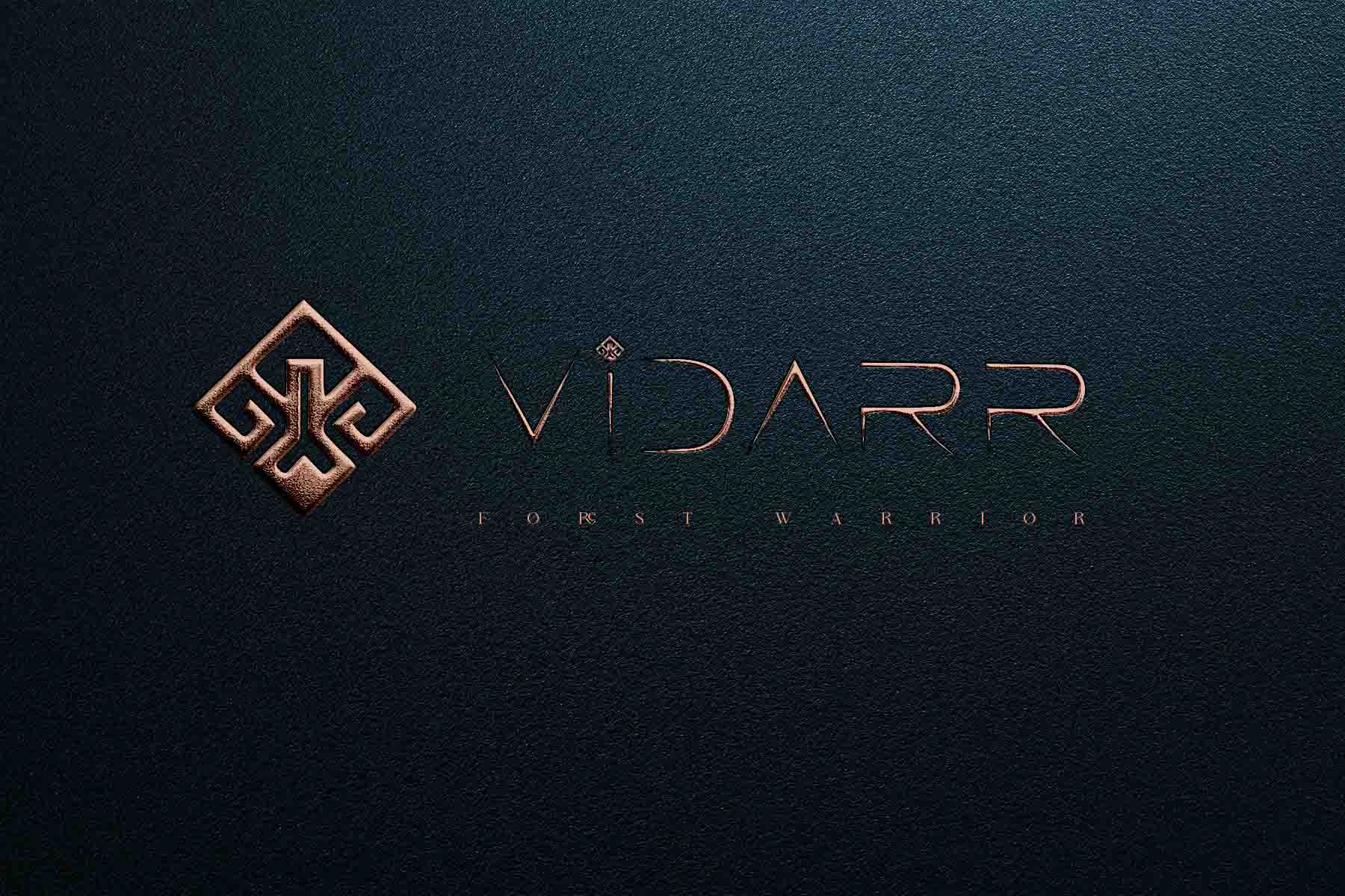
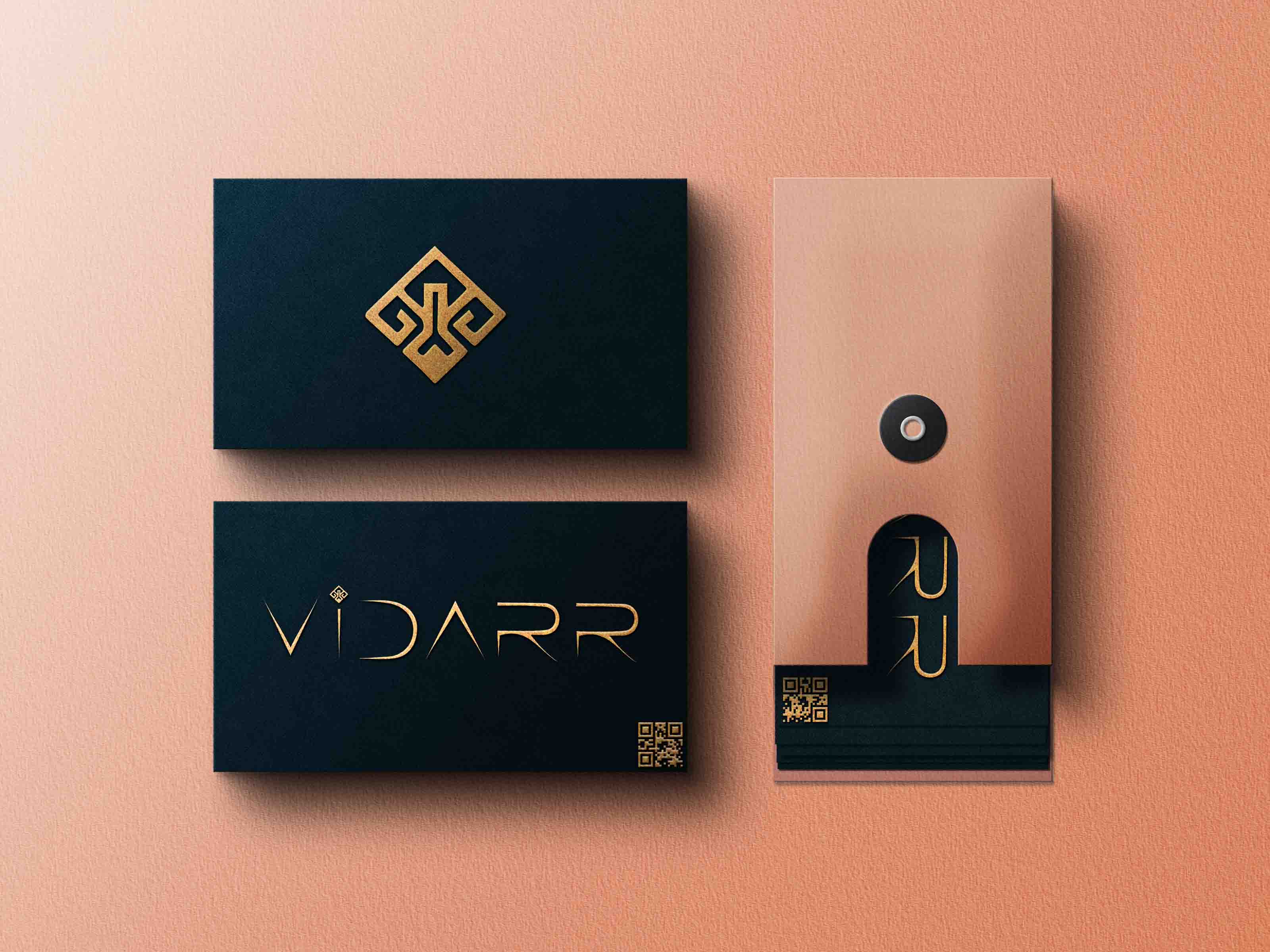
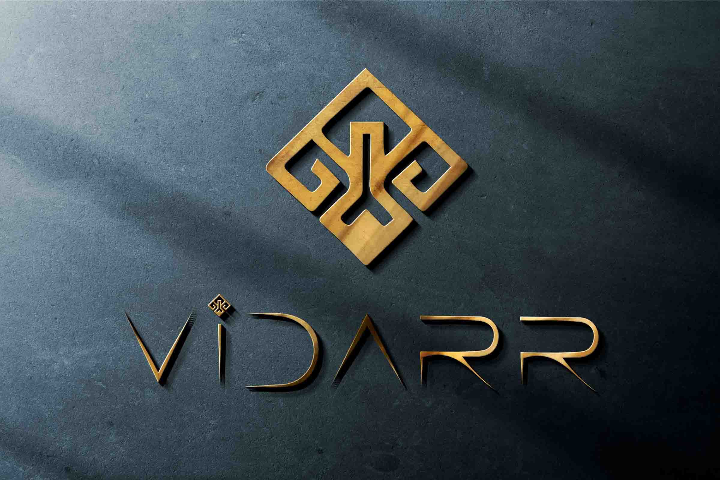
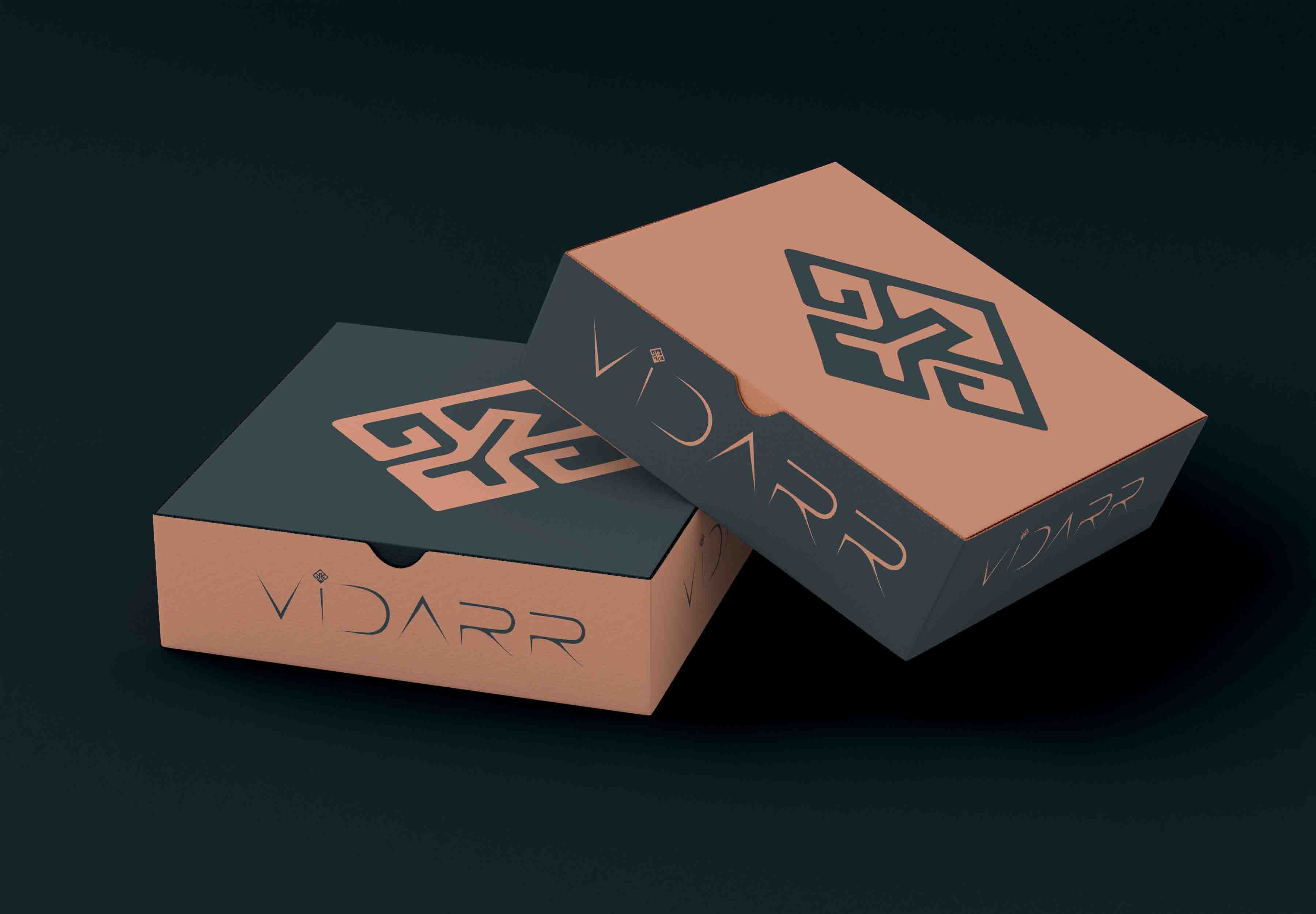
This was a masterpiece of controlled chaos. He in turn penned the letters, each edge sharp and defined, each a reminder of the spirit of the one wearing them. But the series did things its own way. But their endings weren't blunt, they flared in a starry flare, shooting stars, the tips of mystical blades torn from the core of a supernova. This was a font that either danced between earth and the ethereal, or what perfect embodiment of a Vidarr font?
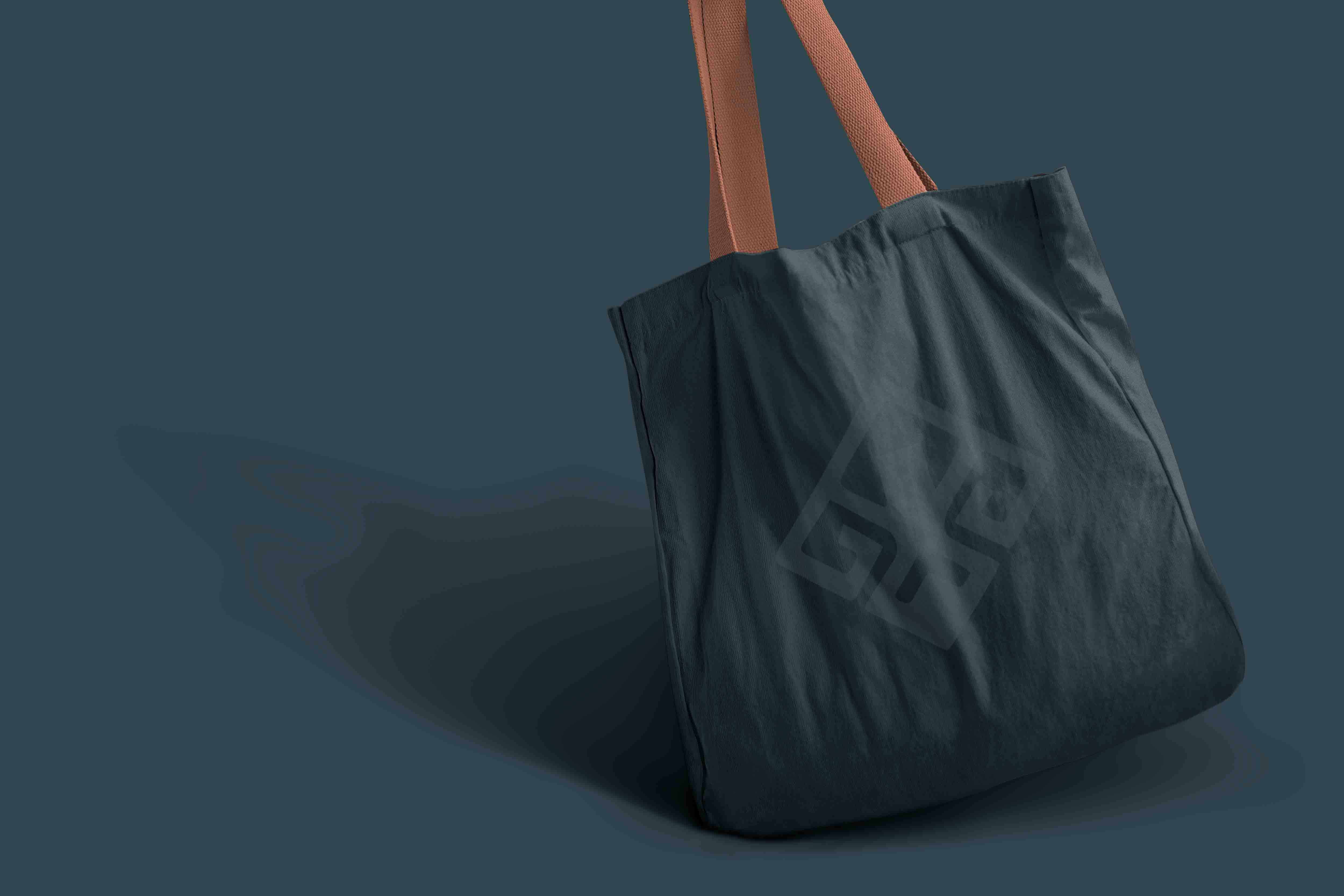
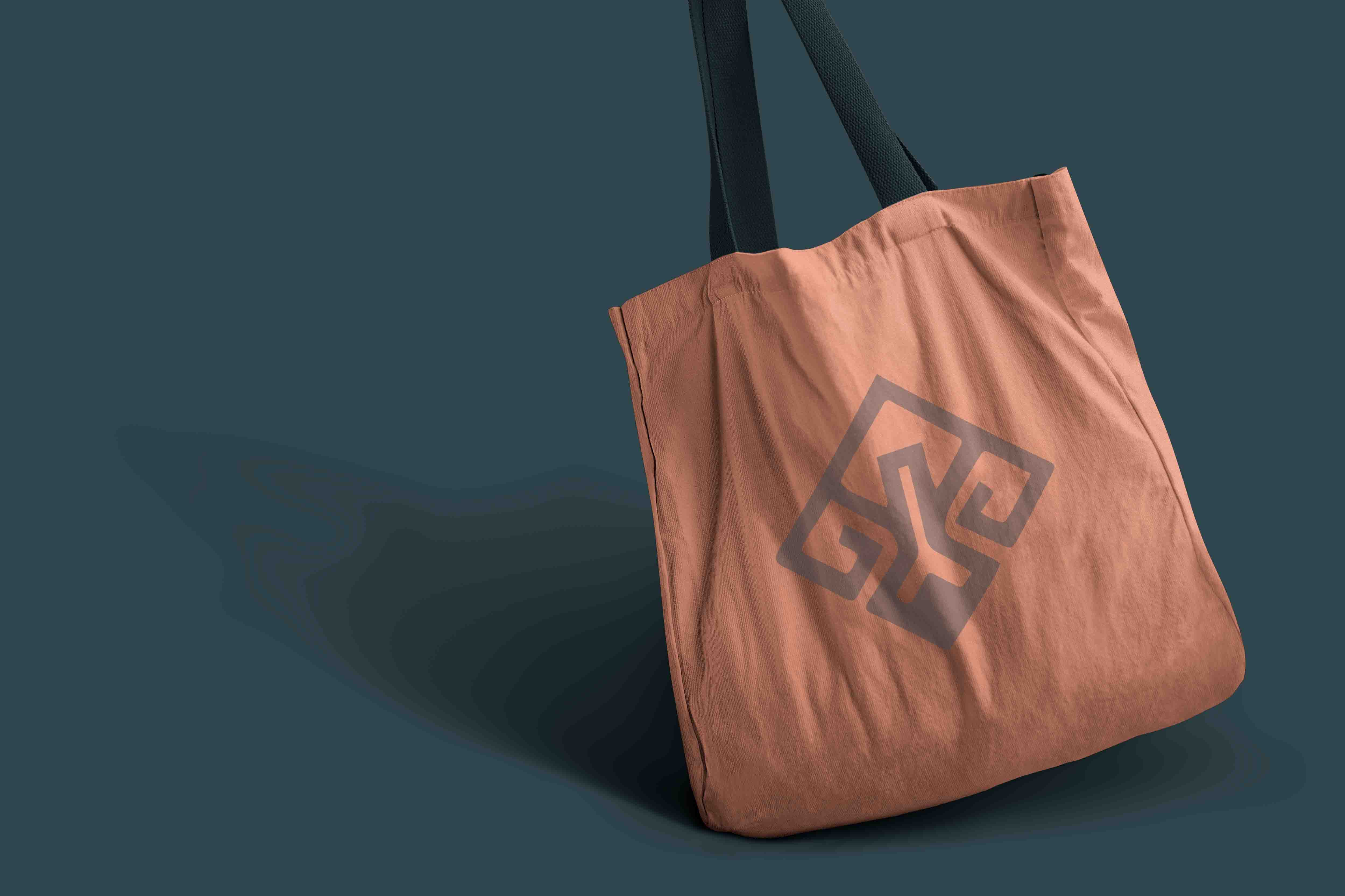
Vidarr was not a logo; it was a living, breathing thing. Spirit of the wild, spirit of the cosmos was woven into every stitch, every button, each hand crafted garment. Brand’s logo is never lacking reminder of its core to defy the limitations, and embrace the wild royalty. The font speaks of celestial battles in the form of untamed earth victories. Vidarr's innovative spirit refl ects ancient and modern.
This was definitely not anything meant for the timid or the faint of heart. It was words shouted by those willing to live in this place, those who heard the whispers of the old forest through the music of the spheres. And it was for the dreamers that fled celestial constellations, the warriors that fought like a lion, and the royalty that walked like a celestial. Their armor, their emblem, the wild royalty they carried with them, which they could unleash.